Work ✿ Book design
The Jane Austen Trio
A collectible set of three Jane Austen novels, designed cover to cover: jackets, spines, and full interior typesetting. Each book has its own fruit, its own color palette, and a tea pairing printed on the back.
The idea
Classic novels get reprinted all the time, and a lot of editions look the same: a stock painting and a serif title. I wanted three books that clearly belong together on a shelf, while each novel still has its own personality.
One border, three books
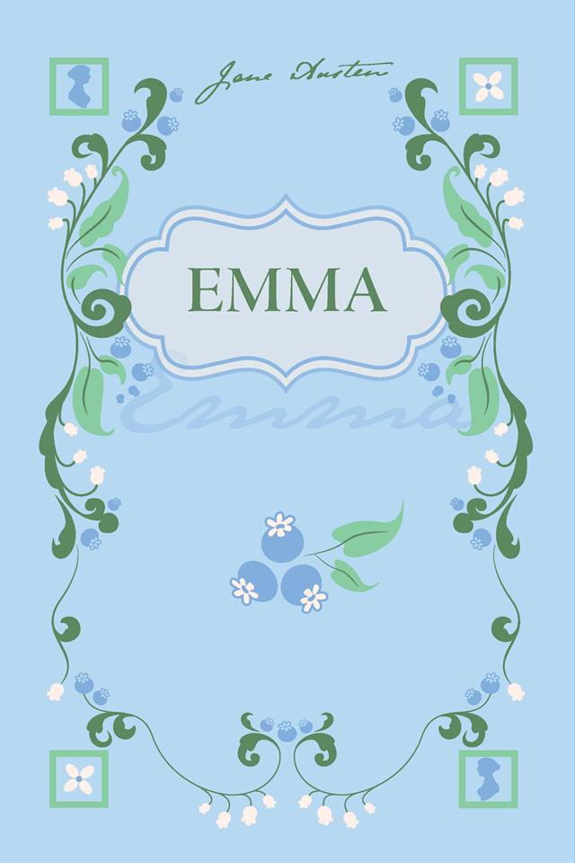
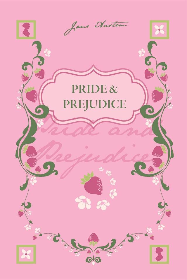
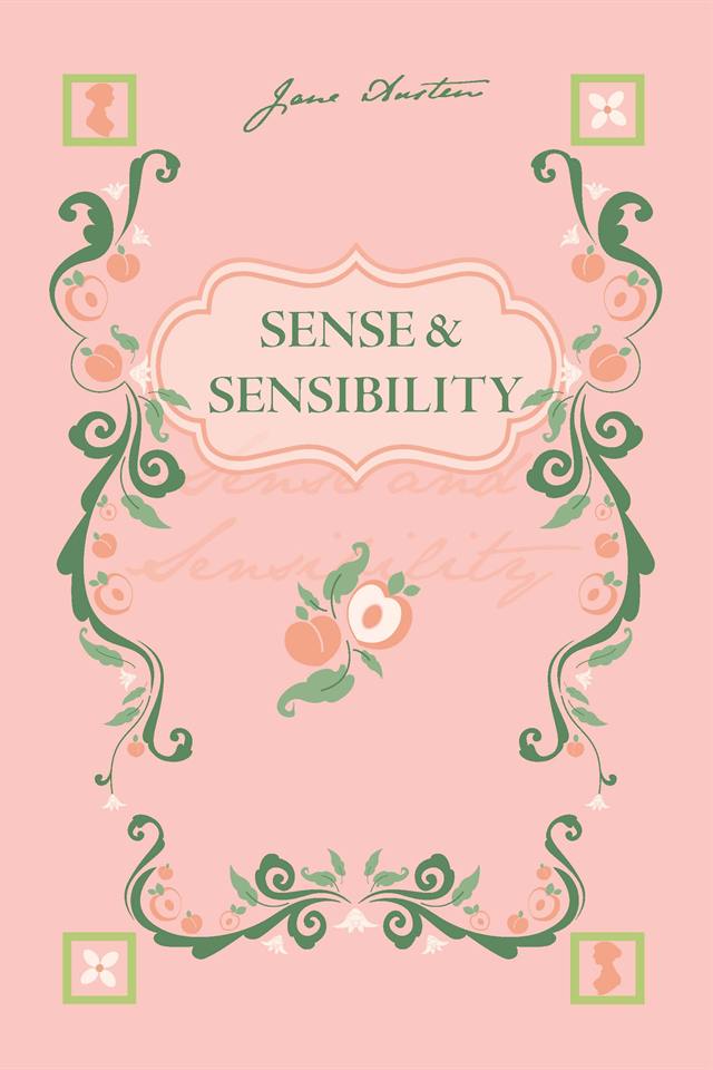
Each cover uses the same hand-drawn botanical frame, redrawn for each book instead of just recolored. All three covers share the same five parts:
- A mirrored vine border in two greens, growing up from the bottom corners
- A fruit motif for each novel, repeated through the vines and clustered at the bottom
- An ornate cartouche holding the title in a green serif
- Four corner squares alternating a Jane Austen silhouette with a quatrefoil flower
- Austen’s signature across the top, with the title in faded script behind the cartouche
What changes from book to book is the fruit and the background color. Emma has blueberries, Pride & Prejudice has strawberries, and Sense & Sensibility has peaches.
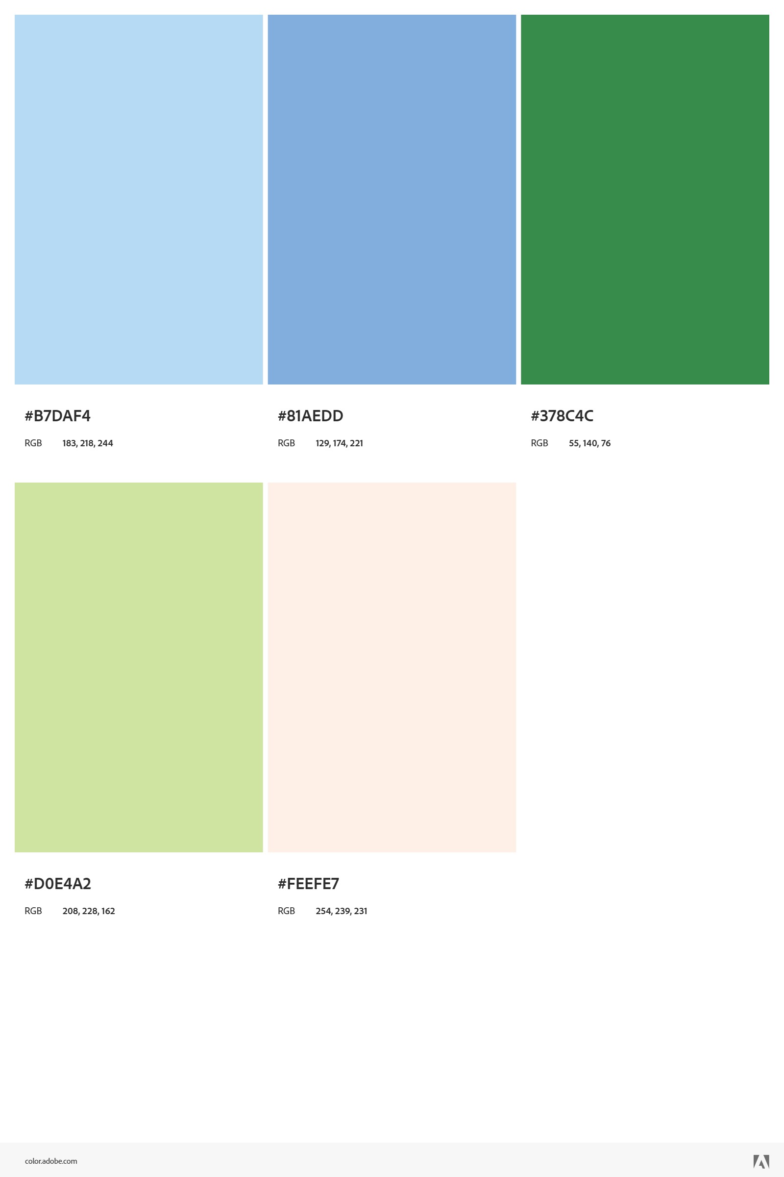
Color palettes
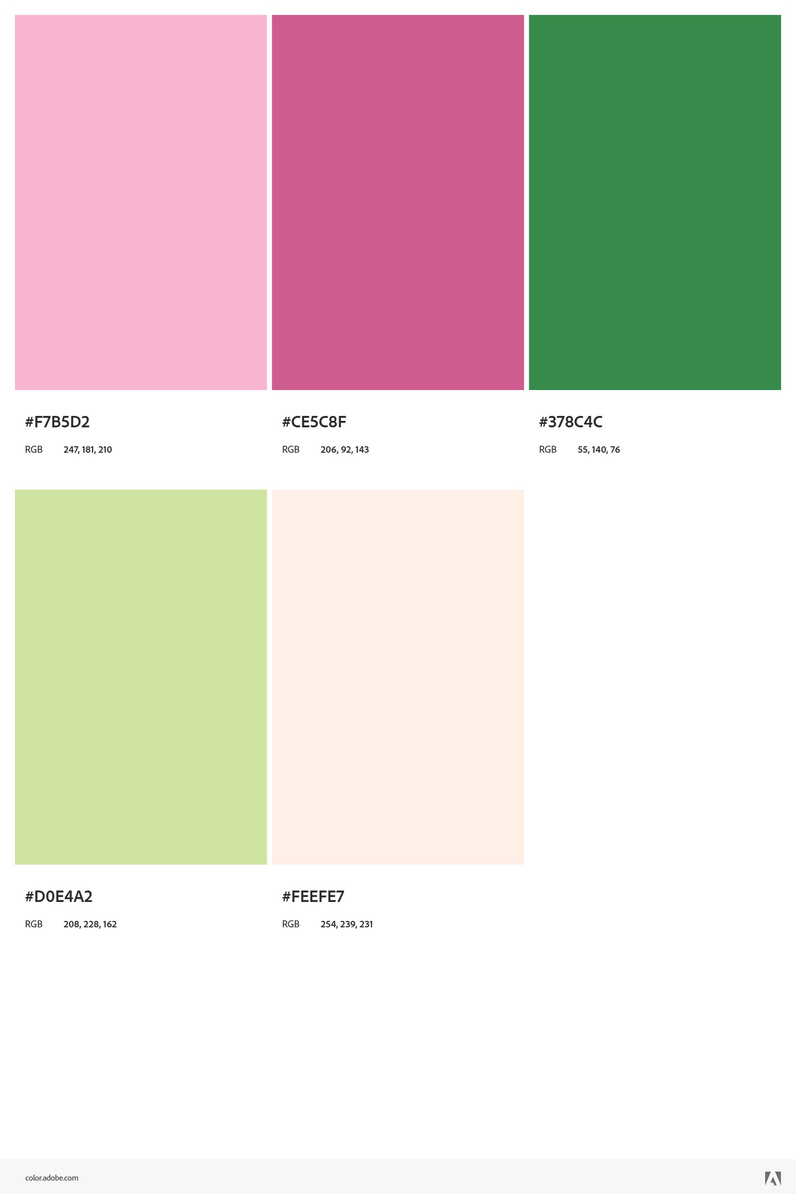
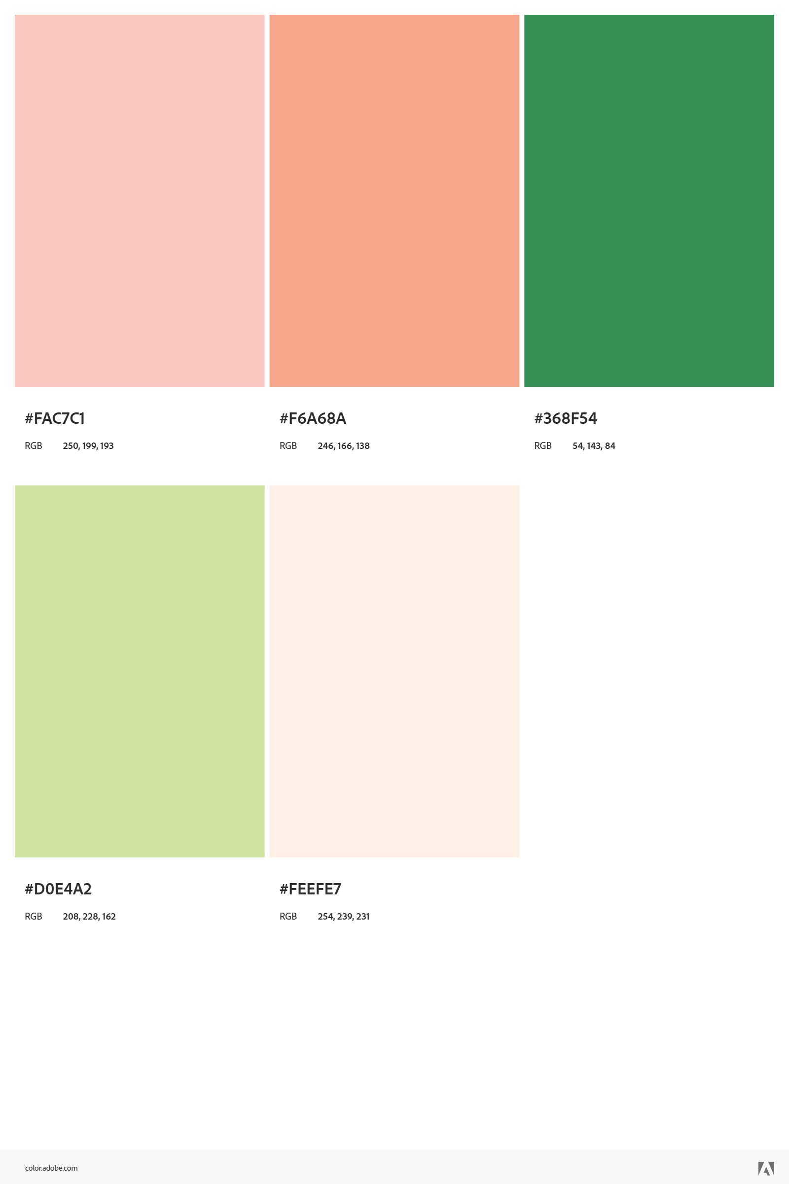
Each palette was pulled from photos of its fruit. The greens come from the leaves, and the pale background colors are the fruit colors lightened way down.
The tea pairing
Each back cover suggests a tea to drink with the book, matched to its fruit:
Back covers on classics usually just carry a summary, so the tea pairing makes them a little more personal.
Inside the covers
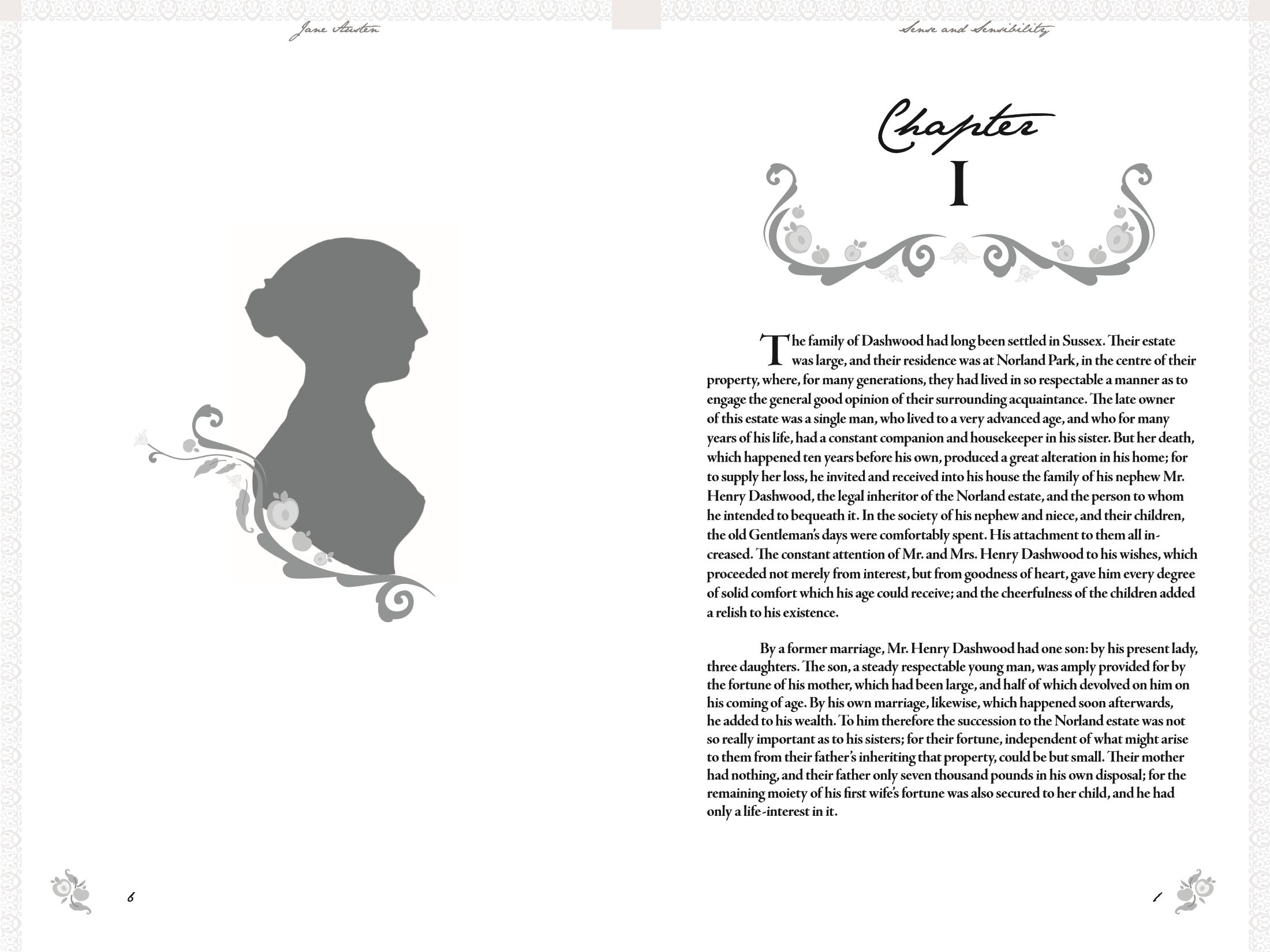
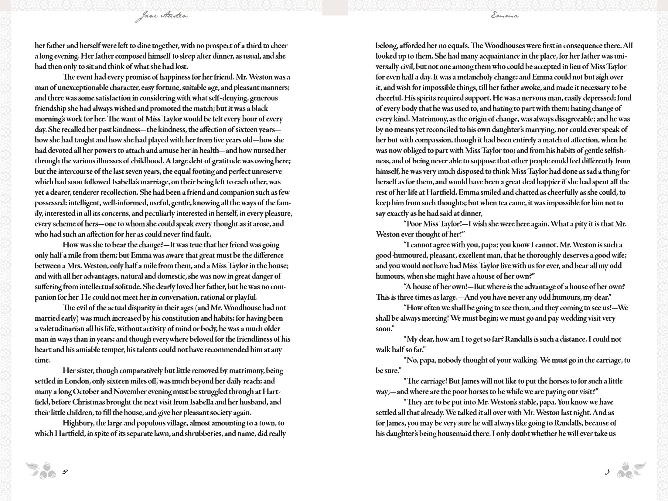
All three novels are fully typeset, with running heads, drop caps, chapter openers, and front matter, laid out in InDesign at the 6 × 9 in print-on-demand trim size. The covers were built on the printer’s template with bleed and the correct spine width. Inside, small chapter ornaments are taken from each book’s vines.
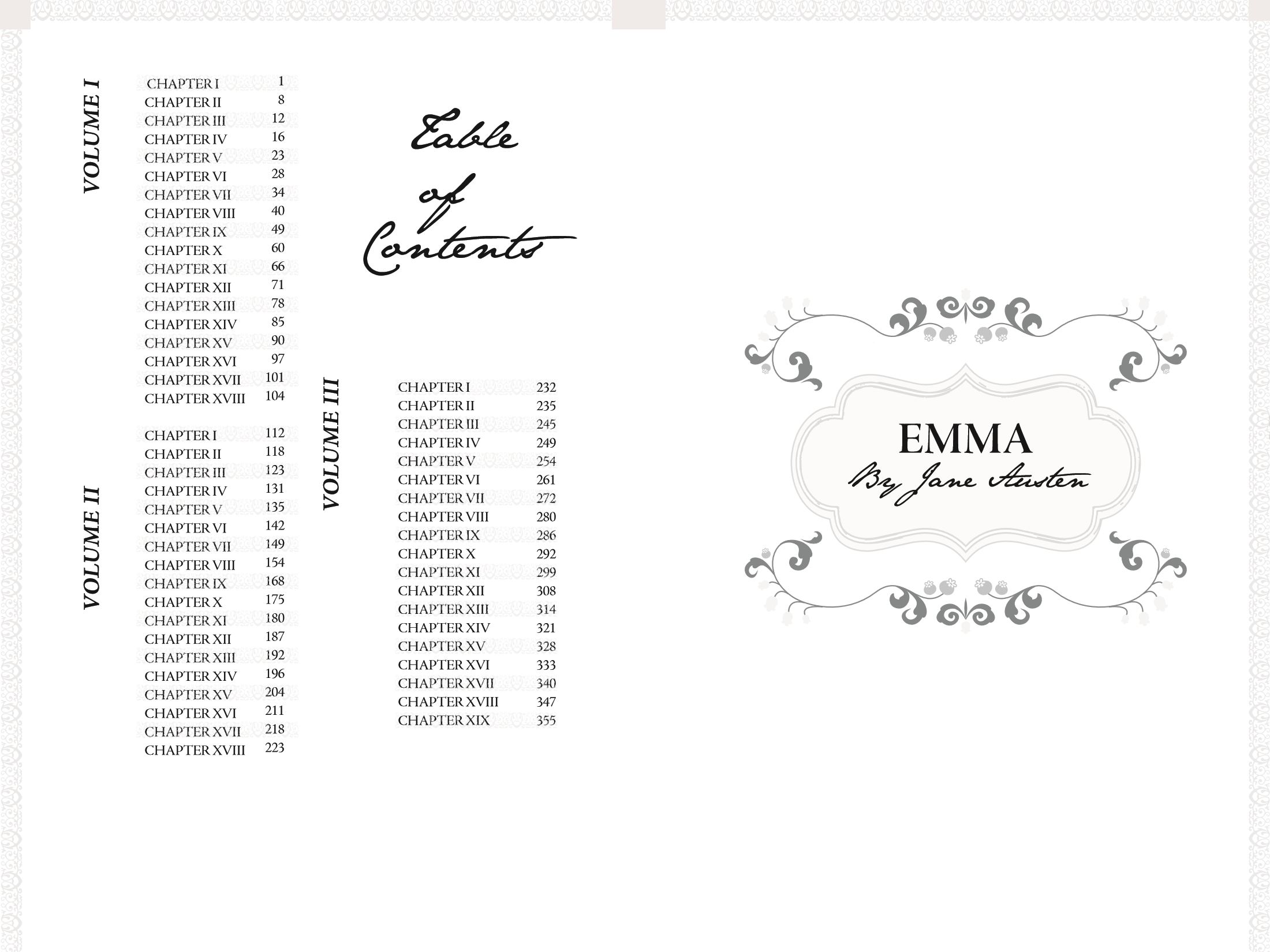
The front matter runs the same way in all three books: title page, contents, half title, then a full-page fruit pattern that clears in the middle for the volume number.
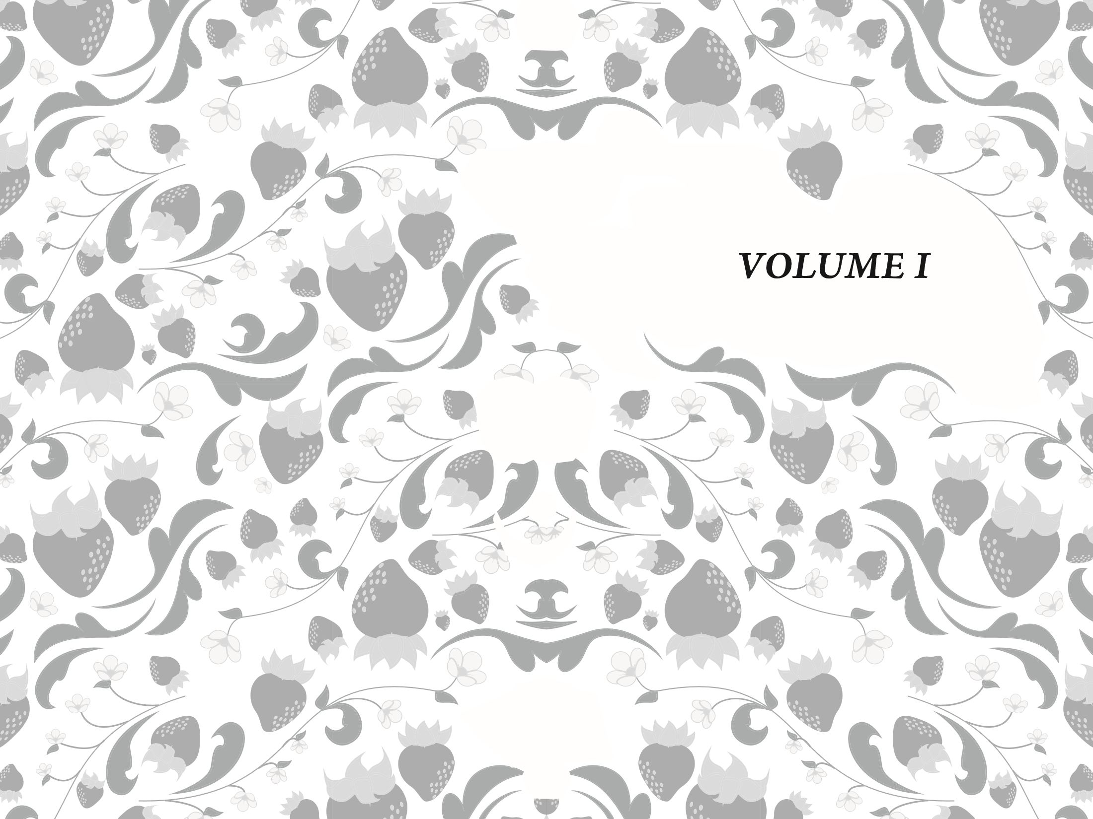
Each volume then opens with Austen’s silhouette on the left and the first chapter on the right. The chapter ornament and the little markers beside the page numbers are drawn from the same fruit as the cover, so the inside matches the outside.
- Trim 6 × 9 in, print-on-demand
- Covers Illustrator • vector, spine width calculated per page count
- Interiors InDesign • full text, front matter, chapter openers
- Type Austen’s signature script, green serif titling, classic book serif for body
- Output Print-ready PDF/X covers and interiors, proofed in physical copies