Work ✿ Concept rebrand
Folgers, Reconsidered
A student concept rebrand that trades Folgers’ bright red supermarket look for a vintage style based on the brand’s history.
The idea
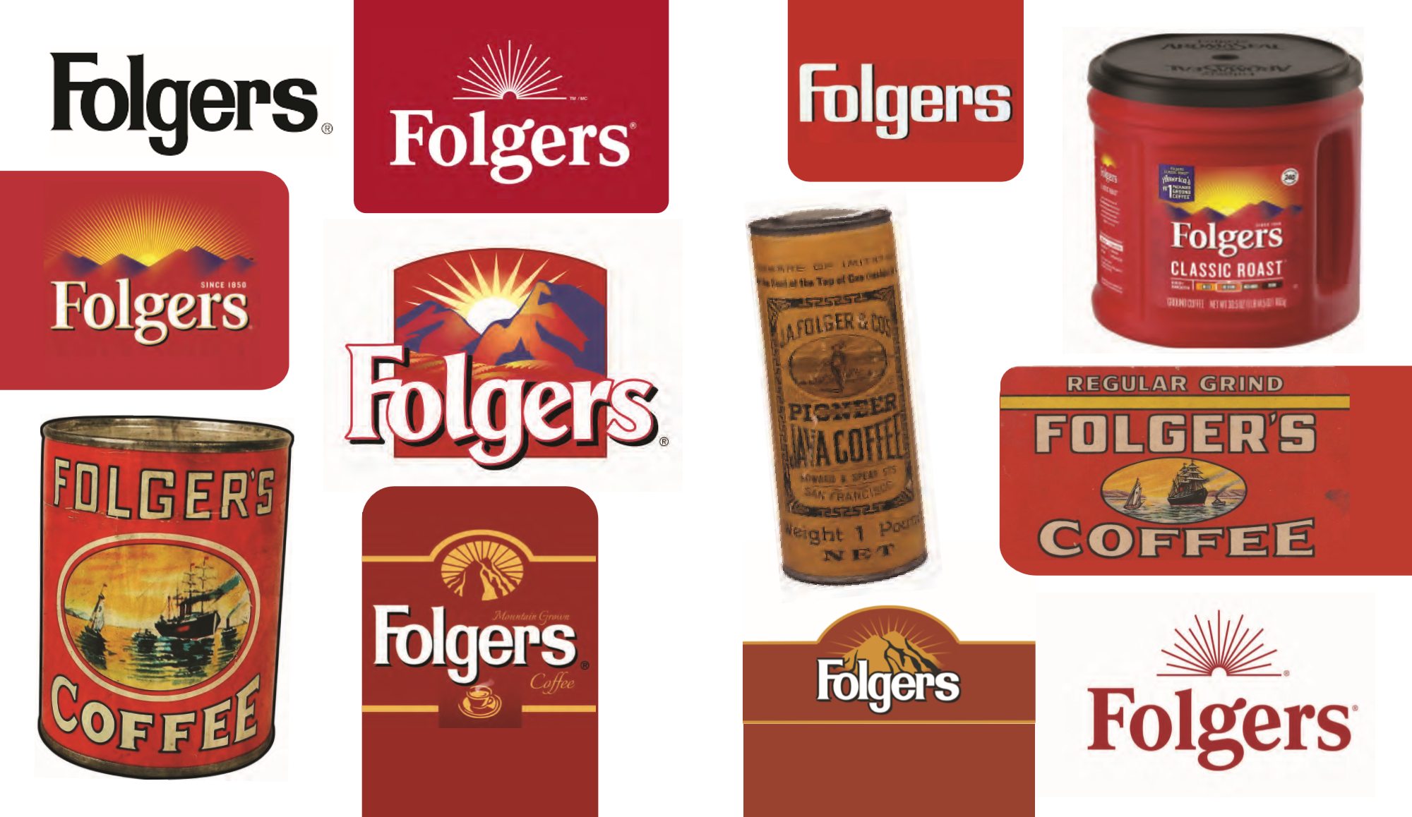
Folgers has been around since the 1800s, but you can’t tell from its branding today. The current look is bright supermarket red, made to stand out on a grocery store shelf. For this project I asked what Folgers would look like if it leaned into its history instead.
The guide opens with Folgers logos and packaging from over the years, from the old ship tins to today’s red can. The new identity takes its cues from the oldest ones.
Mission and personality
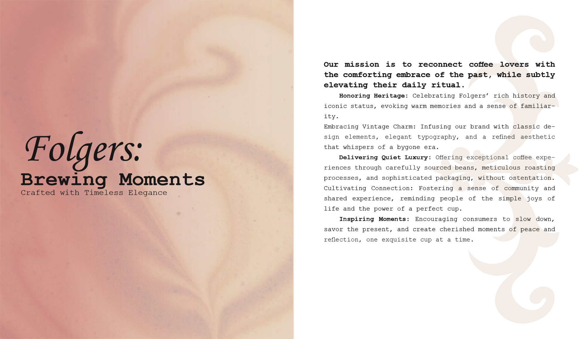
The guide starts with a mission statement for the brand:
It’s backed by five values: honoring heritage, embracing vintage charm, delivering quiet luxury, cultivating connection, and inspiring moments.
The brand’s personality is laid out as what it is and what it isn’t:
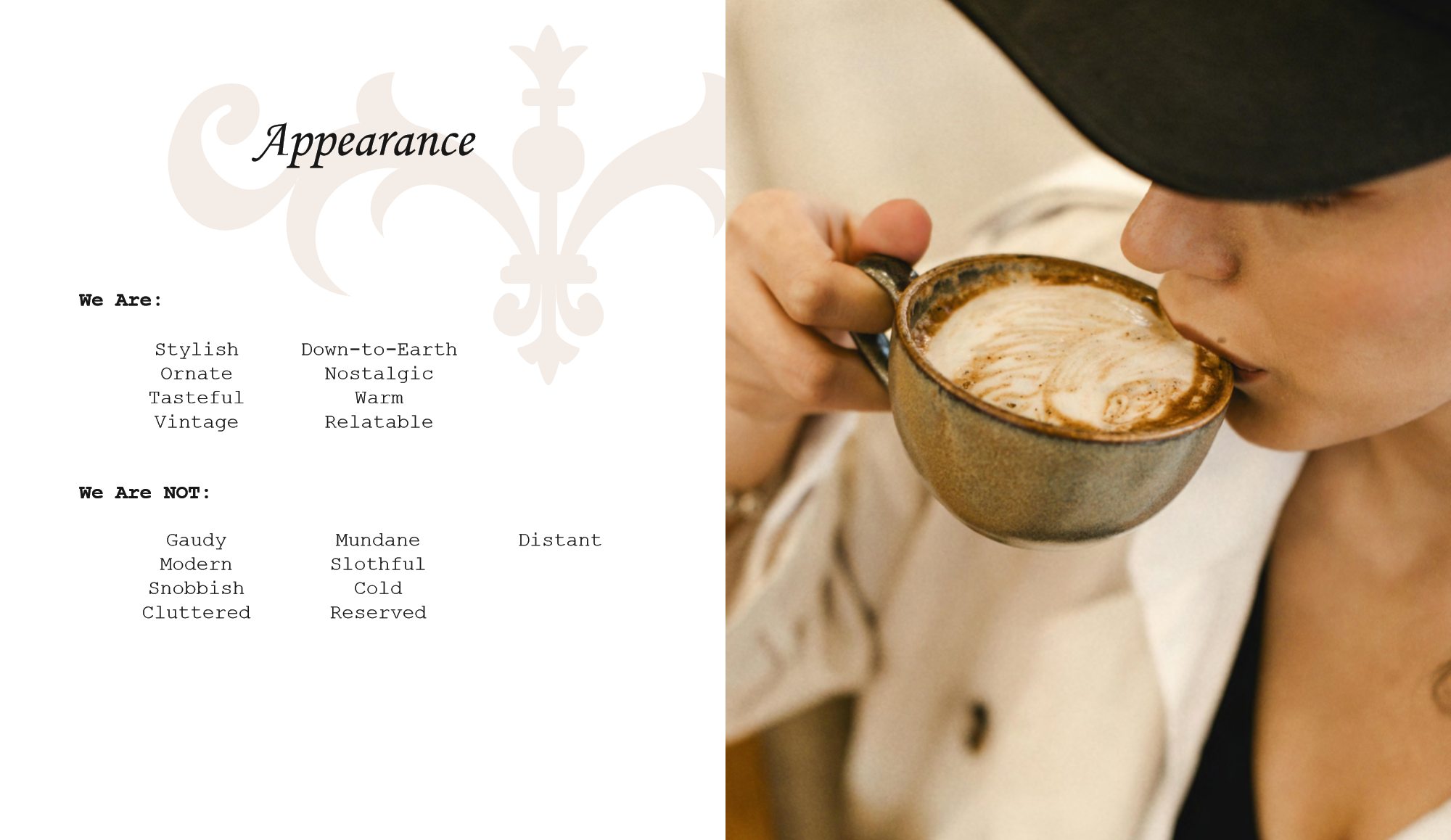
- We are Stylish, ornate, tasteful, vintage, down-to-earth, nostalgic, warm, relatable
- We are not Gaudy, modern, snobbish, cluttered, mundane, slothful, cold, reserved, distant
The logo and the seal
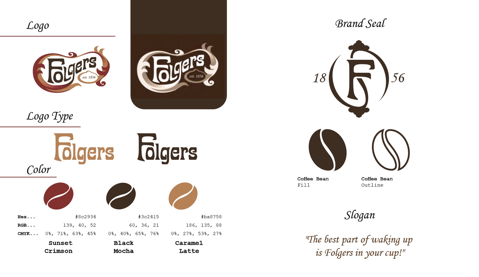
The identity has two main marks. The logo is Folgers set in Allotropic, wrapped in a ribbon of crimson and caramel swirls, with an est. 1856 badge under the tail. On dark backgrounds it switches to cream and white, and the logotype can also be used on its own in Caramel Latte or Black Mocha.
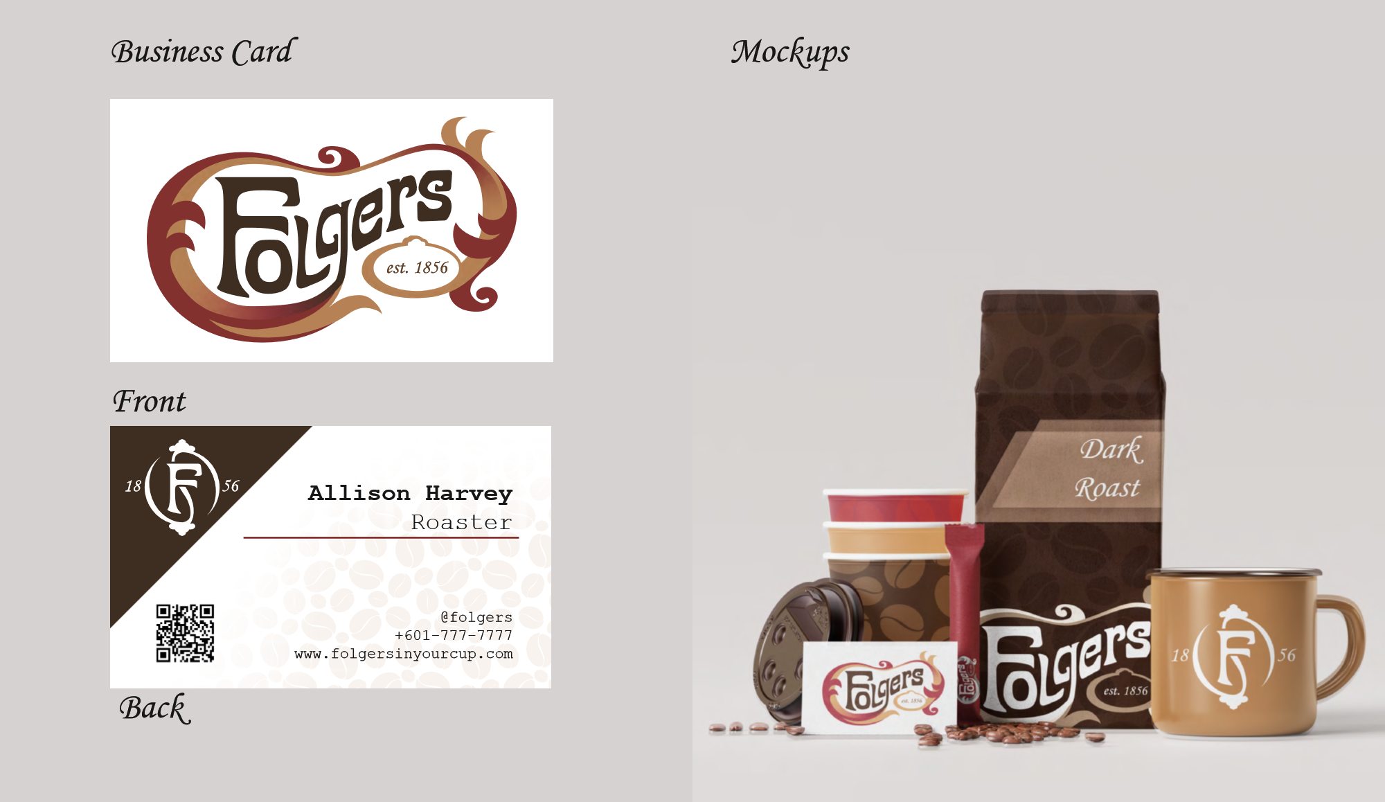
The brand seal is simpler: an old-style F with a long swash tail inside an open oval, with ornamental finials at the top and bottom and the founding year split on either side, 18 on the left and 56 on the right.
There’s also a coffee bean icon in filled and outline versions, and the slogan stays the same: “The best part of waking up is Folgers in your cup.”
Color, type and pattern
The palette is three colors, shown in the guide as coffee beans:
- Sunset Crimson #8C2934 • CMYK 0 71 63 45
- Black Mocha #3C2415 • CMYK 0 40 65 76
- Caramel Latte #BA8758 • CMYK 0 27 53 27
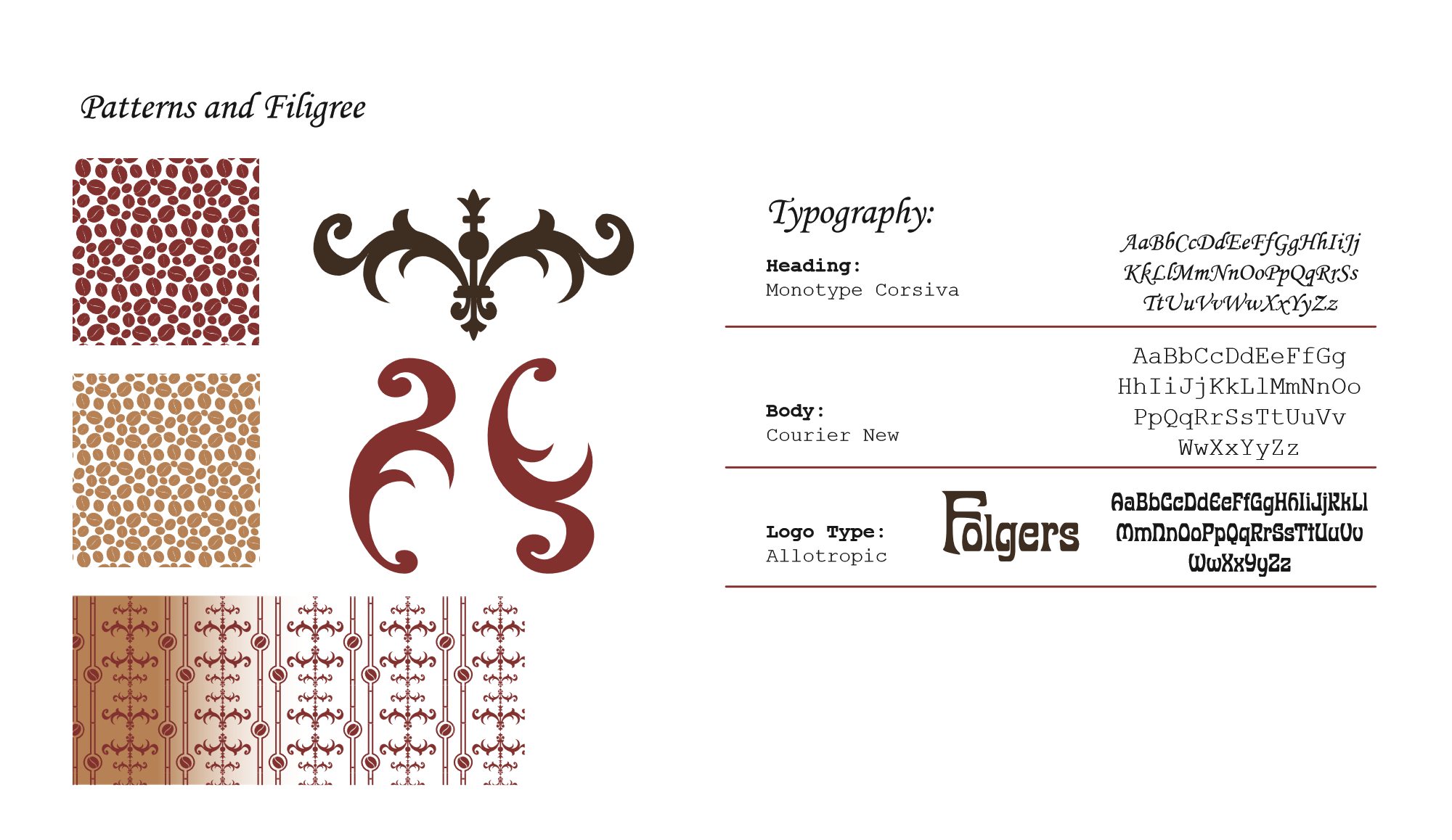
- Headings Monotype Corsiva
- Body Courier New
- Logotype Allotropic
For patterns and accents there’s a coffee bean pattern in crimson and caramel, a filigree ornament, a pair of crimson scrolls, and a striped wallpaper pattern made of filigree and beans.
Rules for using it
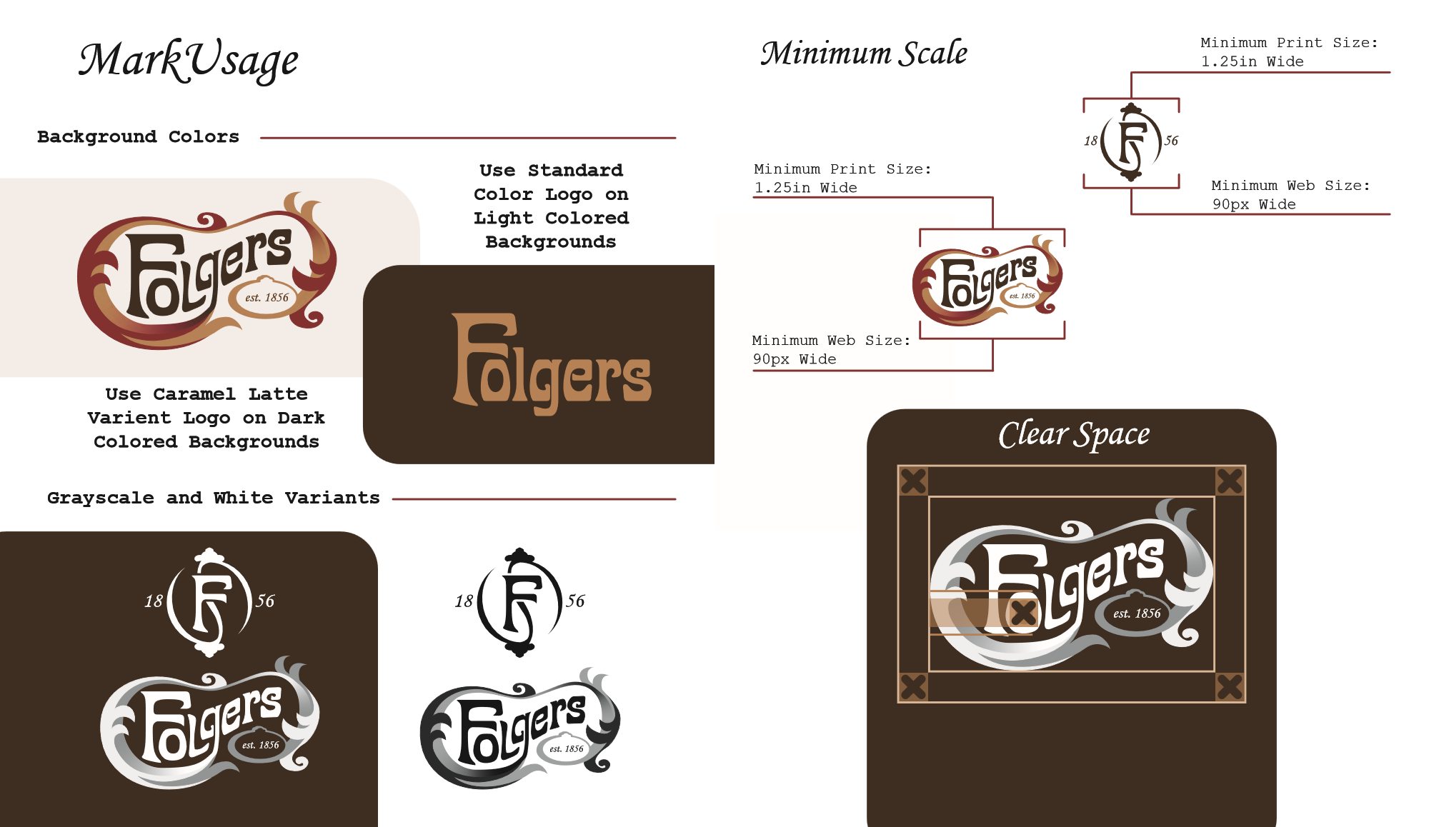
The usage pages cover which logo to use on light and dark backgrounds, grayscale and white versions of both marks, minimum sizes (1.25 inches in print, 90 pixels on screen), and clear space.
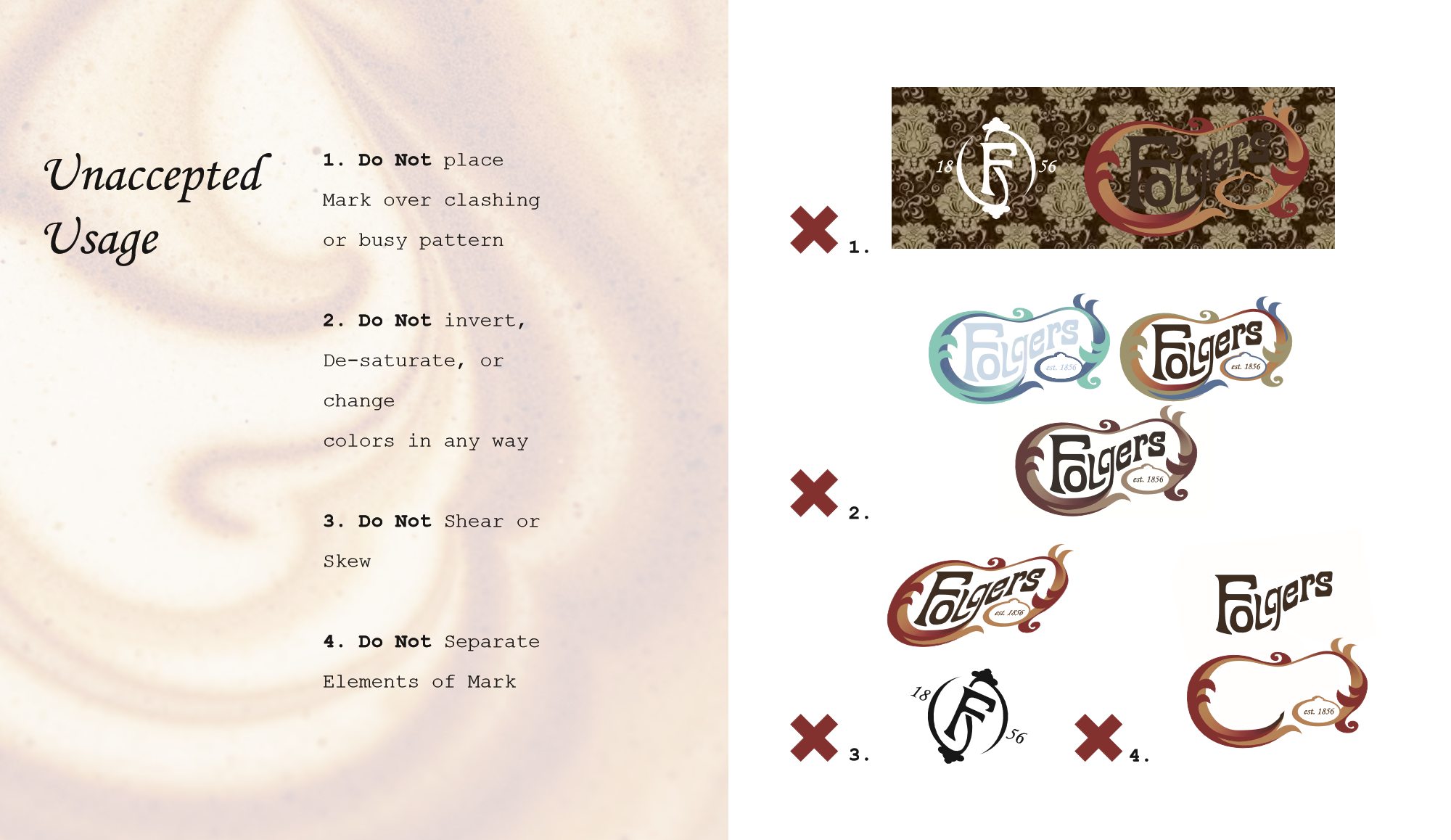
They also show four things not to do: put the logo over a busy pattern; invert, desaturate, or recolor it; shear or skew it; or separate its parts.
Mockups
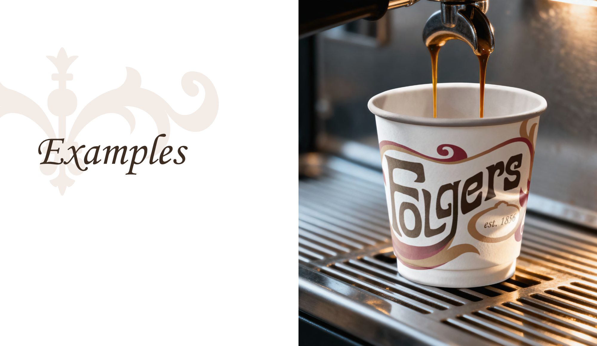
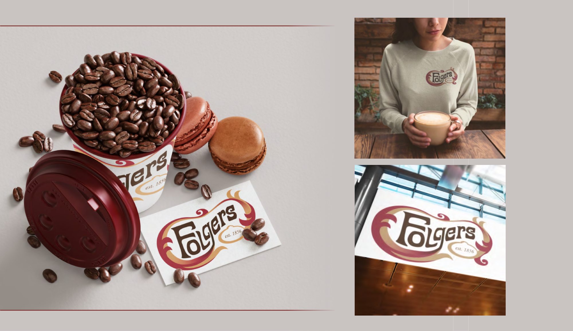
The last section shows the brand in use: a paper cup, a two-sided business card, a Dark Roast coffee bag, an enamel mug with the seal, cups and lids, a sweatshirt, and a hanging sign.
Folgers is a registered trademark of The J.M. Smucker Company. This is an unsolicited student concept, produced for portfolio purposes, with no affiliation or endorsement.