Work ✿ Logo & identity
Dewberry Brews Coffee Co.
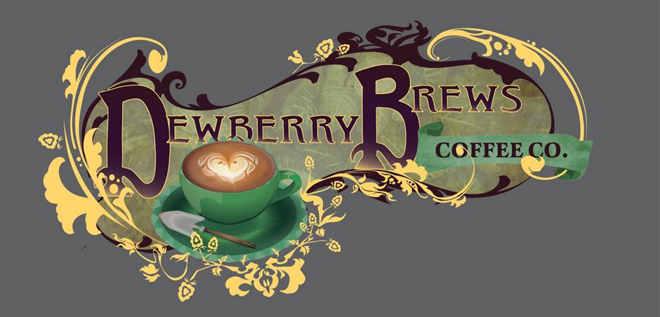
An art nouveau logo for a coffee company, built around a cup of latte art.
Where it started
A lot of coffee logos are either a simple sans-serif with a coffee bean or a round badge with a mountain in it. For Dewberry I wanted something more decorative, a logo that feels like a cozy café you’d want to sit down in.
The lettering
The lettering is hand-drawn in an art nouveau style: deep plum capitals with thick, organic strokes, and large decorative D and B initials at the start of each word. Gold filigree curls around the letters into stylized flowers and long, sweeping Mucha-style curves.
Behind the lettering is a shape filled with a mottled green leaf texture. It holds the whole logo together as one shape and gives the gold something to sit on.
The cup
The focal point is a sage-green cup and saucer with a heart rosetta, sitting just below the center with a spoon across the saucer. I put the coffee itself in the middle instead of a bean or a mountain, and the filigree, leaf texture, and banner all lead the eye toward it.
COFFEE CO. sits on a sage banner ribbon off to the right, so it’s easy to read without competing with the name.
Details
- Lettering Hand-drawn, not typeset
- Palette Deep plum, golden yellow, sage and forest green
- Focal point Heart-rosetta latte in a green cup
- Descriptor Sage banner ribbon, right-hand side
- Format Vector, scalable from a stamp up to signage